Xes mean many things to many people.
- xox – Hugs and kisses,
- x on home window – saving the glass in event of a cyclone
- x on a pirate map – treasure!
- x on a computer screen – close, dismiss, incorrect, sign here …. it is not always as clear as you think
While not all scenarios described in this blog where “x” is used would cause a failure of the Web Content Accessibility Guidelines (WCAG), failure to account for some of the items mentioned in this blog can lead to some users being unable to utilise aspects of your website, mobile app or web application. So let’s start looking for buried treasure and find the Xes.
Everyone knows X marks the spot. This is a long held notion we picked up in childhood reading books about pirates and buried treasure. 2020 became particularly difficult for pirates. Everywhere you went there were Xes all over the place!
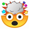
When we talk about digital accessibility however, we want to see less Xes. I always saw mention to this phenomenon and thought it was a bit of a myth, much like a lot of pirate gold. But then I saw it in the wild 3 times in a single month, which made me think, maybe this is a lot more common than I thought! While it is commonly accepted that the close button is visually designated by an “X” NEVER should you actually implement it with the text character for “X”. The close button should ALWAYS have an accessible name. “Close” usually works pretty well, but if you want to get really flashy there are a few other options, “Close this dialog”, “Close this window”, “Dismiss this notification” but please never simply “X”
What’s in a Name
Like most people when it comes to buttons, they generally have two names (I mean even the pirate Blackbeard was probably called “My sweet little Eddie-weddie” at some point by his mum). When it comes to buttons it’s the same, they have a visible name which is displayed on the button and then they have an accessible name which is a programmatic name which can be accessed by assistive technology, such as screen readers and refreshable braille displays. Often these two names overlap, but sometimes they can be very different. Generally however people who name a button “X” probably are unaware of these differences.
Ways to set a visible name on a button
The icon example
<button type="button">

<i class="fa fa-close”></i>

</button>
Note when assistive technology interpret this code, it will simply identify an unlabeled button
The text example
<button type="button">Close</button>Note when assistive technology interpret this code it will simply identify a button with label “Close”
The “X” example (no pun intended)
<button type="button">X</button>Note when assistive technology interpret this code the it will simply identify a button with label “X”
Ways to set an accessible name on a button
First let me say accessible names get a bit more complex and if you want to get the full information you should really check out the Accessible Name and Description Computation. (Note there are a lot of Xes in that computation too, but none end up being either the visual or accessible name!)
Note there are additional way to set an accessible name. In this blog we are only discussing a subset of the most common ways.
The default Image button example
<button type="button" class="close"

<img alt="close" src=“https://linktoclosebuttonimage/closeImage.svg”>

</button>
The text alternative (icon example)
<button type="button" class="close" aria-label="close">

      <span class=“fa fa-times" aria-hidden="true"></span>

</button>
The aria-label example
So what happens when someone creates a button with visible name X and no directly specified accessible name alternative?
Assistive technology will identify “x button”. This has got to be the hidden pirate treasure or maybe a button with a genetic mutation.
This also fails the following criteria within the WCAG
Are you speaking my language?
If you saw a tick mark (whether on a button an alert or other) what would this mean?
- In Australia this would generally mean “Correct” or “Yes”
- In Japan this can mean the same as a cross (X) i.e. wrong. “O” generally is the symbol for correct. – Anime nerds learn this quickly.
- In Sweden it means incorrect
- There may be differences across other geographies.
Adventures in time
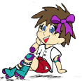
Language and cultural differences are not the only scenarios where icon only buttons could cause problems. If you asked my Mum to draw a picture of a phone it would be very different to what my friend’s 5 year old son would draw (and not just because my friend’s son has much better artistic ability) an old landline phone looks very different to the mobile phones most kids know today.
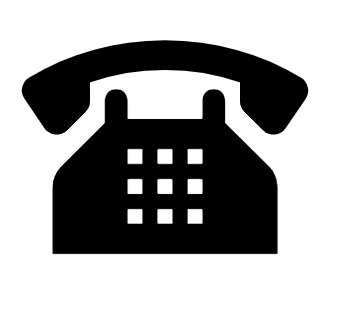
Figure 1: My mum’s version of a phone
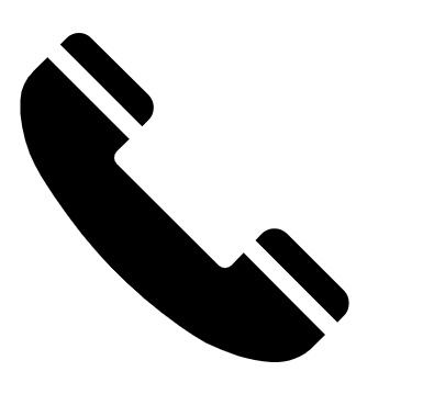
Figure 2: My version of a phone
Figure 3: My “nice” and “nephew’s”* version of a phone
* my nice and nephew are children of a friend who has no siblings both Cyborg and I are considered “adopted aunts”
Emojis are another challenging option which can be influenced by your age, level of sarcasm and general internet knowledge. Is the winking tongue out emoji (????)playful, sarcastic or drunk? Is the happy face with hands (????), offering me a hug or is it up on sexual assault charges? What the heck is the cat pulling duck face about? (????) Is the skull and crossbones (☠) indicating a pirate whose treasure I am tying to steal or is it indicating death lies in wait for whoever presses the button it labels? All this is just about enough to make my…
How Do We Make Icon Buttons Accessible
Ok guaranteed some people are going to fight me here, but please hear me out. Include visible text with your icon buttons, not just text alternatives which are only available to assistive technology. So using our close button example this would look something like the following:
Image button with visible text
<button type="button" class="close">

<img alt="" src=“https://linktoclosebuttonimage/closeImage.svg”>

Close

</button>
The text alternative (icon example)
<button type="button" class="close">

<span class=“fa fa-times" aria-hidden="true"></span>

Close
</button>
I agree that for some users, text is more difficult to interpret then images, but conversely, for others, images without text (I am pointing at you IKEA) can be just as challenging (and in IKEAs case very judgmental of my singledom.)
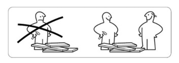
Figure 4: Ikea sign indicating do not build alone
So like many things in our lives, we need to find a way to balance people’s needs. Including:
- People with dyslexia who may prefer images over text
- People with language, cultural or age differences which may impact their interpretation of images
- Users who use assistive technology and the accessible name of components over the visible names
- Pirates who are still looking for their lost treasure and accidently closed the treasure map window on their iPad.
If you are still not convinced I am just going to leave this image here.
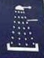
Figure 5: Clearly an image of a Darlek …or possibly not?
While I doubt anyone would use this image alone as a button label, if they did I think you will all agree that it is the “unleash the Darlek button” … No?
In case you have not seen this image before it is actually a sign from Japan indicating a shower.
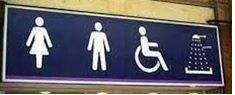
Yeah I know it still looks like a Darlek to me!
Let’s have three cheers:
A11y, A11y, A11y. Always!
For further reading I recommend checking out HTML Hell Blog – Close Buttons